Strange Journals
Ramblings on Bookbinding, Photography, Journaling and ArtA Few More Hearts
Long and Skinny
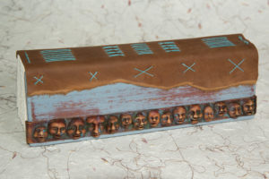
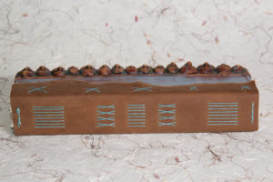
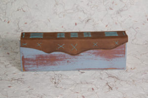
I’ve written in the past about what I affectionately call Scrapbooks. If you missed that posting in the past, Scrapbooks are books that I bind from the scrap material that is left over from other projects and generally, they tend to be on the small side. A few days ago, I found a long, skinny piece of red oak that was about 3″ X 24″. My first impulse was to cut it up into several pieces and make three of four scrapbooks, but then I stopped and thought about making a book that was long and skinny instead.
I finished the covers with several coats of milk paint in several different colors, and then create a distressed finish by sanding through the paint. After I finished the covers, I felt that they needed something more, so I made a band of polymer clay faces to attach to the cover to give it a more dimensional feel. Eight signatures of 200gm Artistico Fabriano watercolor paper were sewn to a leather spine with 4-ply Irish Linen thread which was then sewn to the covers. Here are some images of the finished journal, you can click on the images to view them in more detail.
What Happens to Scrap Clay?
If you’ve read this blog, you know I work in a variety of mediums; wood, metal, paper and polymer clay to name a few. Recently, I’ve been fooling around with the Mokume-gane technique again. It’s a great technique and you can achieve amazing results with it but one area in which it falls short, at least for me is in creating large flat sheets like book covers. At any rate, I was tinkering with it when a friend stopped by to drop off some holiday cookies and I had the block and some shavings out on my work surface. If you haven’t tried this before, basically you layer up a block of different colors, deform the layers to provide interesting patterns and then shave thin slices off the surface of the block. This particular friend is a little OCD and is particularly fond of orderly stacks of things and when they saw the thin shavings I’d taken off the block and other partial blocks of clay scattered around asked, “what happens to all the scraps?”
Most people who work with polymer clay have scrap bins and every bit eventually gets used. Sometimes similar colors just get mixed together for a project or it may all just get mixed into some muddy grey or brown chunk of clay that ends up as a base or unseen part of a project. This time, I just decided to use the scraps on the spot and see if I could preserve the variance in the colors I had used in the mokume-gane block. I think an email from one of the big box craft stores triggered this; frankly I didn’t read the thing but I swear it had something about Valentine’s Day in the subject. A few minutes later, I had shaped the scraps into a pile of hearts. In the photo below, you can see a few of them, the three on the left are raw clay and the three on the right are already baked. The only difference you may notice is that the colors are a little deeper in the ones that have been baked.
Once baked, I wet sanded then starting at 400 grit and ending at 1200 grit. Your average craft store or Home Depot type sandpaper isn’t meant to be used for wet sanding so pay a visit to your local auto paint store, they’ll have the stuff in stock ranging from 400 grit to 2000 grit. Once the wet sanding was complete, I took the outside to my buffing wheel and buffed them out to a high gloss. Here are a couple of shots of the finished ones. I should probably mention at this point that Sculpey may not work for this; you can do the mokume-gane technique using Sculpey, but it won’t buff to a high glass like Premo or Fimo will.
I’m pretty happy with the way the colors play together and the big surprise was they way the plain old Super Sculpey worked out. That’s pretty much it. The only thing left to do is drill into the top of each heart and add a sterling eye pin so it can be strung as a necklace or earring. Cheers.
Peerless Palette
A few months ago I scored several of the small Peerless Bonus Packs at a going out of business sale. The small bonus pack has forty colors on 2″ X 2″ sheets. Normally, they’re in the $22.00 to $26.00 range but the because I’d been a frequent customer the owner ended up charging me $10.00 each. They’ve been sitting on my desk for a while and I’d been considering making a small coptic bound book out of one of them but after tinkering around I decided against it. I would have had to interleave each color with an acetate sheet and the whole affair would have ended up being too bulky.
Instead of a book, I ended up opting for Jane Davenport’s solution. I’ve seen various riffs on this theme and while I wanted to make one, I’m fairly lazy and I felt like measuring everything out would be a drag. I went the digital route and used Adobe Illustrator’s distribute function to line everything up. Once the template was done, I cut a piece of 300 gsm Fabriano Artistico down to letter size and ran it through my laser printer. The pallet is made from both the Peerless Bonus pack and the Peerless Complete Edition and I just cut the sheets up with a pair of scissors and applied them to the palette with some Tombow permeant adhesive. The only thing not pictured, is a piece of acetate that prevents the colors from rubbing together.
Want to make one of your own? Download the template by clicking on the link below:
Three of Three
I’ve been traveling for my Clark Kent job so I hadn’t had time to complete the third in a series of three books I had been working on until today. I used wood to create the covers for the first two in this series but on this one, I chose polymer clay simply because cutting up tiny pieces of wood on a table saw presents some safety issues. The coverall size of this book is small, it’s 1 1/2″ X 2″. Not too much too say about it you can just look at the photos, the front has a contrasting stripe of black polymer clay and the back has some copper studs.
Two of Three
I wrapped up the second book in the series of three I’m working on late last night. The covers for this book came from a board that I uncovered while tidying up. I remember buying this board, a piece of Fiddleback Maple because it had some spalling along the edge and I wanted to work it into the design. While the wood looked beautiful on it’s own, I wanted just a touch of contrast so I did some inlay using a scrap of Bloodwood with the same technique I used on the small Walnut Journal.
Pretty much a lazy choice on my part but hey, the tools were already out. To get everything where it needed to be, the back cover ended up just short of the length it needed to be and I was just going to live with it but I realized I had enough left on the Bloodwood scrap so I edge-glued it onto the back cover, trimmed it up and brought it up to the right length. It’s difficult to see in the photo, but you look closely you can just make it out along the bottom of the back cover, it’s only about 1/4″ wide. This book is 8 1/2″ X 5 1/2″ – enjoy.
Coming Soon, Three New Books…
This year the 4th of July fell on on Wednesday which as you might imagine left an awkward space in the middle of the week. Binding some books seemed like a good way to fill the space so I grabbed a package of Fabriano Artistico and began tearing it down. Beyond the mid-week lull, the other factor driving me was that my small Mesquite Journal only had two pages left in it. It’s a small journal, about 4 3/4″ X 3″ and I made it from the branch of a mesquite tree that a storm took down. Over the time I’ve been working in this journal I’ve really gotten to like the size so I wanted another one the same size. Here’s a shot of the Mesquite Journal i you haven’t seen it.
5 1/2″ X 8 1/2″ is also a favorite size so after a few quick calculations six sheets yielded enough for three books. One 5 1/2″ X 8 1/2″, one 4 3/4″ X 3″ and a micro-book 1 1/2″ X 2 7/8″. The first book out of the three completed was the one I intend to replace the Mesquite one with. The covers are walnut burl. Like the mesquite journal, I inlaid the cover with a contrasting wood, in this case fiddleback maple. Here it is.
More to come.
Review: Fabriano EcoQua Notepad
I must have had my head down because I completely missed this one. If you’ve read my blog for any length of time you know that I almost exclusively use Fabriano Paper in my hand bound journals. While I use the journals I make, there are still plenty of Moleskines, Rhodia notepads and Quattro pads around the house and it seems like they multiply like rabbits. A couple of days ago while I was browsing through a Utrecht store I discovered the Fabriano EcoQua.
The Fabiano EcoQua comes in a variety colors which include Lemon, Lime, Raspberry, Wine, Black, Blue, Stone, and Orange. A variety of sizes and binding styles are available also and i snagged the A5 size which is around 8 1/4″ X 5 3/4″. The paper inside is dot ruled with light grey dots and the pad is bound along the side with a glued binding. The front cover is a heavy textured card stock and the back cover is lightweight cardboard.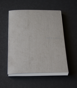
Here’s the front cover, you can see the texture and may be able to make out the Fabriano embossed into the cover.
Here’s a shot of the back cover. Not much there except for the details about the pad itself.
Here’s a photo of the binding. It’s fairly typical for a pad and is glued padding compound which is a fexible PVA adhesive. Like any other pad, you can easily pull off sheets of paper.
The pad is made from smooth 85gm paper. Side by side with a Rhodia, I’d say the the paper in the EcoQua is almost, but not quite as smooth and it doesn’t seem as opaque as the Rhodia paper either. The paper is off white and I want to say it leans toward a cool grey but that may just be the dot rule tilting my perception. The paper does take ink incredible well. I tested the pad with a Lamy Safari pen with a fine point and Pilot’s Iroshizuku Yama-Budo ink. It’s a great red-purple color and while it is a wet writing ink, the EcoQua took it without any problem. There was no feathering to speak of and it seem to dry fairly quickly. You can see a sample in the image below.
Here’s a little better detail of the ghost.
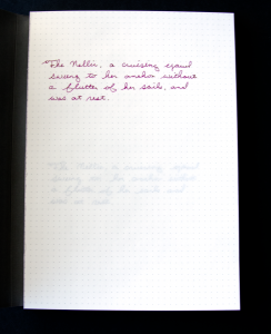 I still had some questions about the opacity of the paper so on the second sheet of the pad I jotted down some text with a Lamy Safari pen with an extra fine nib and Noodler’s Black ink. If you look closely you may be able to see the text on the second page ghosting through just about half-way down the page. Not a show stopper, but something to be aware of if ghosting is something that really bothers you.
If you’re environmentally conscious, Fabriano’s got that covered. The pad is made in Italy in an environmental responsible way that is certified by the FSC. The paper is chlorine and acid free and is recyclable.
Overall, I really like these pads and I’ve already gone back and purchased a couple more to strategically locate throughout the house and office. Since I focused on the A5 adhesive bound pad in this review, I really didn’t enumerate all the options that are available so here’s a video about the product that I found on YouTube that will give you a better idea of the other options.
And… The Teacher Is Still Sending Notes Home About Me
It started innocently enough. A few weeks ago while running through the weekly list of spelling words with my son I doodled a cockroach in the margins of the page. A week later it was a picture of a dinosaur and after that my son expected a drawing. A few weeks later, I got home late and didn’t have a change to draw anything so the spelling list went back to school with nothing but list of words.
The next day, I got a note from the teacher explaining that she couldn’t accept my son’s homework because the drawing was missing and that made it incomplete. I had to break out the watercolors and whip something up so he’d get credit for his assignment. And just when I thought he days of the teacher sending notes home about me was over…
The Last PLAY
I’ve been remiss in posting over the last few months. I’ve been working on another project which has been burning up a lot of time but now that I’ve wrapped that up, I think I can get back on track.
A couple of weeks ago, I attended the last PLAY Retreat. Teesha and Tracy Moore have decided to terminate their large art retreats for a variety of reasons and its been a tough haul knowing that I probably won’t make it back to Fort Worden anytime soon. This time, I took just about nothing with me except for a handful of fine-line pens and a book of Peerless Watercolors. The retreat had no specific focus this year like it has in the past, just forty artists working away.
One of the things we did do was some light painting that everyone seemed to enjoy. Tracy used his Lomos while I went digital. here are a couple of the nicer shots I got from the light painting sessions.
Here’s Teesha Moore with wings of light.
And here is Dawn DeVries Sokol, author of 1,000 Artist Journal Pages: Personal Pages and Inspirations and other books on art journaling.
While I brought very little in the way of art materials I did bring a couple of lights in addition to my camera, and offered to do portraits for anyone who wanted them. One of the people who took my up on the offer was Lisa Cheney-Jorgensen. While most people we’re interested in something a little more traditional, Lisa had a special request — she wanted a pose she had seen in a dream so she could make it part of here dream journal. Here’s the shot.
A couple of hours after I gave a print of this image to Lisa, it was already in her journal. I’ll miss PLAY.


