by Steve | Dec 2, 2010 | Bookbinding |
Field Notes have received a lot of press over the past couple of weeks. First, they were declared to be “all the rage” on the Today Show. A day or two later Reuter’s featured Field Notes on their site. This promoted me to look at the Field Notes site again, and as I was going through some of the older editions from the Colors series, I noticed that most of the colors they’ve featured are derived from things in the temperate north.
Nice enough, but out here in the Southwest, we don’t see the golds of Mackinaw Autumn and it’s generally to hot to grow the marigolds that came with the Spring 2010 Packet of Sunshine edition. I decided to pitch my own color scheme for Spring of 2011 and send it on to the staff at Field Notes. I called it Spring in the Desert and the color scheme is derived from a cactus flower typical of the ones you see in the desert Southwest as we move through spring. I used Adobe Illustrator to mock up the covers and sent the image on to them, if you like this, give them a shout and let them know.

Here’s the image that inspired the color palette.

by Steve | Nov 9, 2010 | Bookbinding |
So what are these things anyway and why have they developed such a cult following? Well, in terms of the form factor their nothing special, 3 1/2″ X 5 1/2″ same size as Moleskine Cahiers. Unlike Moleskine’s their stapled and not stitched and the covers have been offset printed with their logo, and a gentle reminder that Filed Notes are made in the U.S.A. They’re a little thinner than my homemade ones, probably because the paper I’m using is a little heavier. Field Notes uses a 50 Lb. text while I’m using a 60 Lb.
-Edit.jpg")
The printing inside the front cover provides a place for you to jot down some personal information so your book can find its way home if it gets lost. The rear cover includes the back story for the books, a list of “Practical Applications,” and the books specifications, the paper, the ink and the printing processes that were used.
-Edit.jpg")
-Edit.jpg")
The paper used in these notebooks is Boise Offset Smooth 50 Lb. I wrote on the first page with a variety of pens and inks to see how it would hold up. From top to bottom, a Faber Castell Ambition with a fine nib and Noodler’s Habenero, a Lamy Safari with Noodler’s Gruene Cactus, A Lamy Safari with Pilot Iroshizuku Yu-yake, a Lamy Safari with Pilot Iroshizuku Syo-ro. Next a few standard pens, Pilot G2s in yellow, brown and turquoise, a couple of Zebra Sarasa’s in red-black and slate blue, a couple of Uniball Signo 207s in blue and black. All in all, the paper holds up well. The fountain pens had the slightest amount of bleed through with the Ambition being the worst but — it’s a brand new pen so I’ll try it again when it’s not freshly loaded with ink.
-Edit.jpg")
So far, I’m satisfied with what Field Notes has to deliver. I’ll have one more saga in this story, I ordered their limited edition State Fair series. Fifty books, each one representing one of the states in a custom box.
by Steve | Oct 2, 2010 | Bookbinding |
I’ve been trying to get my head back in the game after my involuntary hiatus over the past few months and Carla Sonheim’s Art of Silliness workshop popped up just at the right time. The workshop is a series of drawing and other creative exercises. Before beginning the workshop, I hadn’t really picked up a pen on the past six months or so. One of the exercises she had us do is the traditional contour, you know the one, look at the object and draw it without looking at the paper. This exercise is fairly easy to do an normally you draw an actual object that’s laying around the house but in this case, Carla asked us to use a picture of ourselves. All I could find was a picture of my friend Dean. Here’s how it turned out.

I’ve done better in the past and I’m going to blame this on not having picked up a pen in the past several months. That said, everybody in the house knew who this was when they saw it.
by Steve | Feb 27, 2010 | Bookbinding |
I was reorganizing my bookshelf last week and stumbled across a book I made back in 2004. It’s a small pocket journal whose dimensions are about 3″ X 4″ and it had fallen behind several other books and been forgotten. I can remember making this book because it turned into something I hadn’t intended when I started making it. Whatever I had in mind when I started this book changed along the way. I was beginning work on the cover and NPR had a remeberance about Jerry Orbach the actor that played Lenny Briscoe on Law & Order, he died in December of 2004. As I continued working on it, he book somehow morphed into The Book Briscoe. One of the things the Briscoe character was famous for was the sarcastic quip he typically uttered early in each episode as a dead body was discovered.
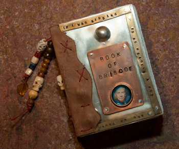
I have a personal favorite and I embossed it into the brass strip that runs around the edge of the front cover, in the event you can’t see it in the photograph, it says; “if I was kidding I’d be wearing a Fez and no pants”. I don’t know that I’d call this a tribute book because that really wasn’t my intent when I made it but it did start me thinking about possibly making a tribute book for Captain Phil Harris. For those who don’t know, Phil Harris was the captain of the fishing vessel Cornelia Marie, a crab boat featured on Discovery Channel’s Deadliest Catch series. Any time I would think about how bad my job was, all I had to do was watch an episode or two of Deadliest Catch to put it all in perspective. Phil Harris died on February 9th, 2010 after suffering a stroke on January 29th. It seems to me that metal would be my material of choice but time will tell as I continue to think about where I want to go with this idea.
by Steve | Jan 10, 2010 | Bookbinding |
For those of you who may not know, PLAY is an annual journaling retreat hosted by Teesha and Tracy Moore. One of the features of PLAY is a optional swap. For the past two years, I’ve bound a small 3 1/2″ X 5 1/2″ pocket journal for each participant. For the last two years I’ve made the same book, I settled on the design the first year because they’re easy to make and sew and since I’m putting about fifty of them together, well… you can see the logic. I do change the cover design and last year I also included a second small book which was based on the design of a Moleskine Cahier.
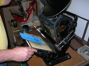
I thought about doing some small leather books this year but as time got tight, I decided to do the same one yet again. This year, I ran into a problem with the covers. I make the covers using two sheets of paper glued together, I use Rives BFK on the outside and black Rising Stonehenge on the inside. In the past I’ve decorated the cover with a simple acrylic wash and then printed the cover art with a Gocco. I wanted a little more texture this year so I went with Paste Paper, when I Gocco’ed the design on the prototype I found that the text and the artwork got lost in the design or the paste paper. I mentioned the problem to Cindy Iverson at The Paper Studio and she suggested using the letterpress; we set up the job so the design would have a little punch. The embossed quality the letterpress lent to the cover makes it work. Here’s a photo of the printing job in process.
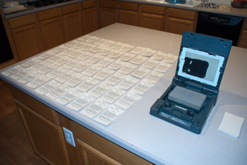
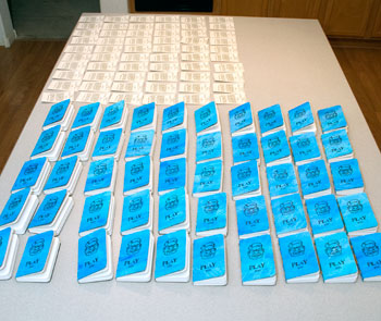
Once the cover design wan printed the rest of the process was fairly straightforward, throw on a movie and just keep sewing like a madman until their all done. I ended up making 53 books, enough for everybody attending and a couple of extras — one for Andrew Borloz at Urban Paper Arts and one for Cindy at The Paper Studio for her help with the letterpress. Here are a couple of photos as they near the end of the process, the Gocco printing of the Colophon and the books waiting to have the Colophon pasted and then get packed up.