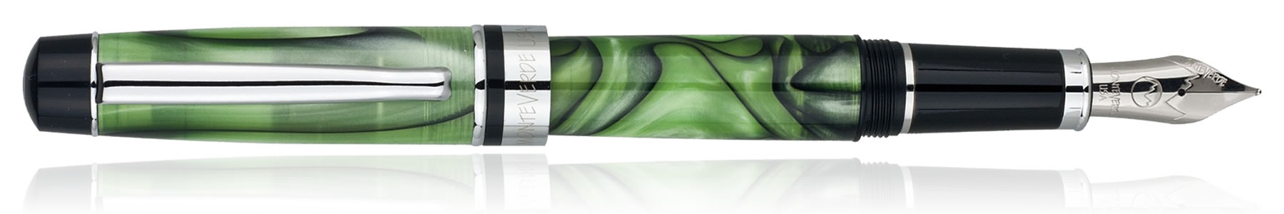
I recently acquired a new fountain pen from the helpful people at Pen Chalet. I’d been looking for something new for my everyday carry after Sketchbook Skool; something I could use to both write and draw. I was looking through Pen Chalet’s website and the Monteverde Prima caught my eye, the Prima comes in 5 different colors and I decided to go for the green swirl. I had thought I’d be seeing an opaque green but the color was nicer than I expected with different shades of iridescent jade green streaked with veins of black. The resin is translucent and if I have one criticism about the color, it might be a little too translucent but that’s a personal preference.
Monteverde Prima
I ordered the pen with a fine nib because when I ordered it, I had sketching in mind and since I like a fine line it seemed like a logical chose. The nib is stainless steel and while it’s not a flex nib I found that it actually does function like one, I was able to vary the line width without much effort; much less effort than say a Lamy Safari. An ink cartridge and convertor are included and frankly, I tossed the cartridge into my endless drawer of cartridges since I rarely use them; I prefer a convertor so that I can leverage the board array of inks I have on hand. The pen features a screw on cap, you’ll need about three twists to get it off. As a side note, I loved the convertor in this pen because unlike so may others, it screws in so I’m fairly confident it’s not going to pop off.
I inked up the convertor of my new Monteverde Prima with one of my favorite inks, Noodler’s Saguaro Wine and took it for a test drive on the three surfaces I most often use, a Rhodia #16, a Leuchtturm1917 and a sheet of Fabriano Artistico Hot Press watercolor paper. Across the board I found that it wasn’t the silky smooth experience that many people lust after. For me though, that’s a good thing because I like the tactile feedback it makes drawing and sketching a better experience. The line width of the nib is on par with a Faber-Castell Pitt artist pen with the S tip but your mileage may vary since different inks have different properties in terms of how they flow. That said, I went though a couple of different Noodler’s inks and the line width remained fairly consistent.
The Prima is well balanced and comfortable in the hand and while the cap posts well, in this particular pen I preferred to not to post the cap. Nothing about weight or balance here, it’s just a little easier for sketching with when I may be twisting the pen at a variety of angles. Sketching with the pen is a nice experience; the flexibility of the nib was nice allowing me to achieve some variation in line width. With a light touch I was able to get a hairline and a little more pressure allowed me to get to a broader width and was able to create some very nice cross hatching, shading and stippling.
All in all, I thought his was a great pen and I want to thank the folks at Pen Chalet for suggesting it. In terms of the tactical experience it offers more than a Lamy Safari which is pretty much one of my go to pens for sketching and writing. In fact, I’m so satisfied with this pen that its take a place in my journaling bag and has become of my daily carry. Check out Pen Chalet, they have a good selection and are a helpful bunch.
I must have had my head down because I completely missed this one. If you’ve read my blog for any length of time you know that I almost exclusively use Fabriano Paper in my hand bound journals. While I use the journals I make, there are still plenty of Moleskines, Rhodia notepads and Quattro pads around the house and it seems like they multiply like rabbits. A couple of days ago while I was browsing through a Utrecht store I discovered the Fabriano EcoQua.
The Fabiano EcoQua comes in a variety colors which include Lemon, Lime, Raspberry, Wine, Black, Blue, Stone, and Orange. A variety of sizes and binding styles are available also and i snagged the A5 size which is around 8 1/4″ X 5 3/4″. The paper inside is dot ruled with light grey dots and the pad is bound along the side with a glued binding. The front cover is a heavy textured card stock and the back cover is lightweight cardboard.
Here’s the front cover, you can see the texture and may be able to make out the Fabriano embossed into the cover.
Here’s a shot of the back cover. Not much there except for the details about the pad itself.
Here’s a photo of the binding. It’s fairly typical for a pad and is glued padding compound which is a fexible PVA adhesive. Like any other pad, you can easily pull off sheets of paper.
The pad is made from smooth 85gm paper. Side by side with a Rhodia, I’d say the the paper in the EcoQua is almost, but not quite as smooth and it doesn’t seem as opaque as the Rhodia paper either. The paper is off white and I want to say it leans toward a cool grey but that may just be the dot rule tilting my perception. The paper does take ink incredible well. I tested the pad with a Lamy Safari pen with a fine point and Pilot’s Iroshizuku Yama-Budo ink. It’s a great red-purple color and while it is a wet writing ink, the EcoQua took it without any problem. There was no feathering to speak of and it seem to dry fairly quickly. You can see a sample in the image below.
Here’s a little better detail of the ghost.
I still had some questions about the opacity of the paper so on the second sheet of the pad I jotted down some text with a Lamy Safari pen with an extra fine nib and Noodler’s Black ink. If you look closely you may be able to see the text on the second page ghosting through just about half-way down the page. Not a show stopper, but something to be aware of if ghosting is something that really bothers you.
If you’re environmentally conscious, Fabriano’s got that covered. The pad is made in Italy in an environmental responsible way that is certified by the FSC. The paper is chlorine and acid free and is recyclable.
Overall, I really like these pads and I’ve already gone back and purchased a couple more to strategically locate throughout the house and office. Since I focused on the A5 adhesive bound pad in this review, I really didn’t enumerate all the options that are available so here’s a video about the product that I found on YouTube that will give you a better idea of the other options.
I scored a bottle of J. Herbin 1670 Anniversary ink for the Goulet Pen Company last week. J. Herbin who is probably the oldest ink manufacturer in the world formulated this rich red ink to commemorate the company’s 340th anniversary. The color also echos the past by serving as a reminder of the wax seals used by kings and courts throughout history.
I loaded the ink up in a Lamy accent and took it for a spin on a Rhodia pad. The ink itself has a wonderful color with excellent shading and tone. I could go on and on but Lady Dandelion has already provided an excellent review that’s amazingly complete. Give it a read at http://ladydandelion.net.
When I got home today, the Field Notes I ordered Sunday night were waiting for me.
I had ordered the subscription and the first shipment contained two 3-packs of their black Raven’s Wing limited edition, two 3-packs of regular Field Notes, one with graph paper and one mixed. For good measure, I had also ordered a couple of standard 3-packs, one of ruled books and one mixed. Mixed packages contain one each of graph paper, ruled and plain. A couple of goodies were packed in as well, a Field Notes pencil, a Field Notes pen, a Field Notes “General Purpose Band of Rubber” a 1″ button and a decal. Here’s a shot of the contents of the package.