by Steve | May 18, 2014 | Bookbinding |
It’s graduation time again and a family friend, someone we’ve know since he was a wee tot has managed to survive the elementary school system and go over the wall. He’s a talented drummer and over the past couple of years he’s started to journal sporadically with a goal of doing it regularly. I thought it might be nice to bind a journal for him; maybe he’ll go to it more regularly if it’s more meaningful than an off the shelf sketchbook.
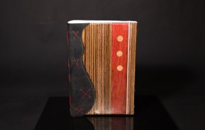
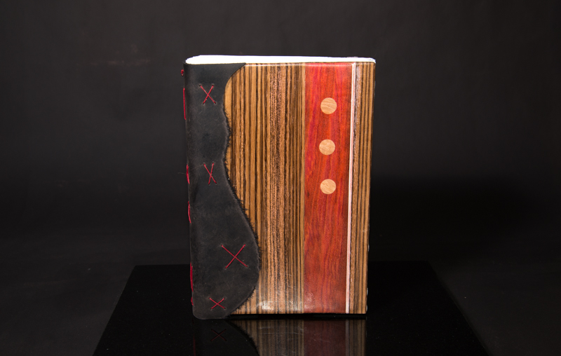
Front View

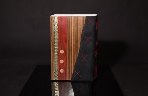
Spine Detail
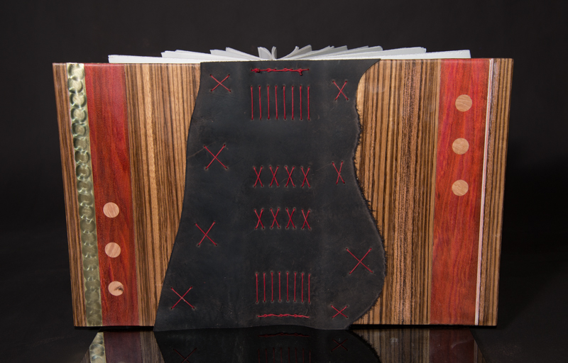
Back View
Zebrawood, Chata Kok, Maple Burl, Brass, Leather, 300 gm Fabraino Artistico 4-ply Polyester Thread
by Steve | Jan 27, 2014 | Bookbinding |
I went on a bookbinding binge the past few days. I finished up a few books I had started and set aside and bound several new books as well. In all, I completed about ten in the span of three or four days. I’ve been focusing on wood books lately because I acquired some more figured walnut and the chaotic pattern of the grain is very compelling. Here are a few examples of what I’ve been working on.

I created this for fellow artist Lisa Cheney. Figured Walnut, Milk paint, Twine, Fabriano Artistico, Irish Linen Thread.

Alder, Rosewood, Fabriano Artistico, Leather, Stone beads, Irish Linen Thread.

Maple Burl, Canson Edition, Irish Linen Thread, Leather.
by Steve | Jan 18, 2014 | Bookbinding, Shows |
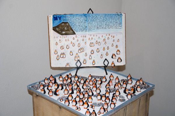
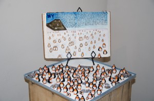
(pre)Occupation, a collaborative show curated by Jo Novelli-Blasko opened at the Hive Gallery in downtown Phoenix last night. Jo asked to be part of the show some time ago and I had decide early on that I wanted to create something in addition to hand bound books. A good deal of the work I’ve been doing with polymer clay lately has been more sculptural in nature and while I really haven’t shown any of it, I thought it might be the way to go. Give the underpinnings of the show however, I didn’t want to create anything elaborate, or serious. A few months ago, I had a funny dream about penguins spilling out of my journal so I created a waddle of penguins for the show. The installation is titled “Levocetirizine” and it was fairly well received. Here’s a shot of the installation, the penguins, eggs and rocks were created from polymer clay, and the snow is corn starch.
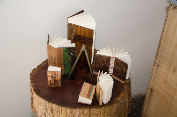
In addition to the penguins I bound five new books with wood covers for the show. From the nine o’clock position moving clockwise they’re titled “A Crack in Time,” “Reclaimed,” “Banded,” “Untitled,” and “The Turquoise Twins.” (pre)Occupation runs through Sunday, February 16th at the Hive Gallery in Phoenix. If you can’t make it to the Hive, I’ll be putting up some better pictures of these books soon; once the exhibit closes I’ll be putting most of them up for sale.

by Steve | May 31, 2013 | Bookbinding |
This morning I fired up the table saw and took out my hostility on some bits and pieces of wood I had laying around. I trimmed them down into blanks that I’ll be using as the covers for some books. There is some Birds Eye maple, Walnut, Shedua, Purple Heart and some Mesquite which is left over from a tree that fell over in my yard a while back. That’s a quarter over there on the right side of the image so you can get an idea of how small some of these books will be.

I’ve been thinking a lot lately about altars and reliquarys so at the moment, the chances are pretty high that at least a few of these potential books will be part of a larger sculptural piece. Stay tuned to see what happens.
by Steve | May 26, 2013 | Bookbinding |
A few years ago, I made a set of 12 editions and a slipcase as a show piece. Essentially, when I was teaching a class somewhere, it would be put out it with a few other samples of my work as an example of what you could expect from my class.
.jpg")
Most people who see this thing really like it and periodically, I do bind editions for a variety of reasons. The covers for this set were made with a decorative paper but I was more interested in doing something with graphics. The books you see below are the same ones I’ve made for PLAY in the past but this time I used an image of Sedona, Arizona for the cover art. I wanted more than that though, I wanted the same image to span the spine so you could see the entire image across the set. I wanted these to be a piece of art on the shelf so that when they were in the slipcase in the correct order the image itself was the primary focus.
.jpg")
.jpg")
To get this effect, I used Adobe Illustrator and laid out guides so I’d know where the spine was. Then, I used transform to keep shifting the image across the cover so that each edition had the correct section of the image on the spine. This was just a proof of concept to see if I could get the alignment correct. I’m planning on making a set of twenty so the image is much larger on the shelf but I’ll need to shoot a panorama to have an image wide enough to pull it off.
by Steve | Jan 3, 2013 | Bookbinding |
Someone wrote me after my posting a few days ago and comment that my hearts weren’t in very Valentiney colors. Fine. Here you go.
.jpg")