by Steve | Nov 27, 2010 | Reviews |
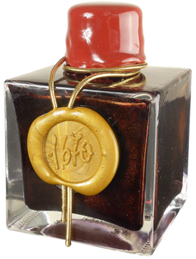
I scored a bottle of J. Herbin 1670 Anniversary ink for the Goulet Pen Company last week. J. Herbin who is probably the oldest ink manufacturer in the world formulated this rich red ink to commemorate the company’s 340th anniversary. The color also echos the past by serving as a reminder of the wax seals used by kings and courts throughout history.
I loaded the ink up in a Lamy accent and took it for a spin on a Rhodia pad. The ink itself has a wonderful color with excellent shading and tone. I could go on and on but Lady Dandelion has already provided an excellent review that’s amazingly complete. Give it a read at http://ladydandelion.net.

by Steve | Nov 21, 2010 | Recently Bound |
I dig through the pile of boards I bought over the summer and decided to put a fairly simple journal together. This journal is 4″ X 6″ and was bound using Bloodwood, leather and 140 Lb. Fabriano Artistico. The Bloodwood was simply sanded and finished with clear Deft Danish Oil. The book block is sewn on to the leather spine with 4-ply waxed linen thread. Not much else to say, just a simple journal.

by Steve | Nov 18, 2010 | Notebooks |
I bumped into Tracy Moore online a few days ago and it reminded me that the annual PLAY Retreat is just around the corner. There’s an informal custom of bringing a small giveaway and each year I create a sketchbook for all the other attendees, they’ve been so well received that I’ve kept the form factor each year I just change the design. In 2009, I gave out a matched pair, a sketchbook and a cahier bundled together with a printed band, but I waited until the last minute to make them last year so it was just the sketchbook.
This year, I decided to start early for a change and I’ve created a prototype for the cahier. I’ve decided to go a little larger with the artwork on the cover this year and after tinkering with several different paper combinations, I’m going with some earth tones this year. Here’s a shot of the prototype:

by Steve | Nov 15, 2010 | Notebooks |
I have a certain fondness for small works of art, their size draws you in and conveys a sense of intimacy. That fondness extends to my bookbinding and I often do multiple edition bindings. More than likely that’s what drew me to the County Fair Edition of Field Notes. Fifty books in a custom box, each book representing a different state, what’s not to like? Last week was a little busy and I didn’t want to rush through opening the package so it got put away until today. The county Fair Edition comes in a cardboard box with a map of the United States printed on the top with the familiar Field Notes logo printed on top of the map. The Great Seal of Field Notes Brand is printed on the lower left corner of the lid. The whole package is tied up with some sisal twine.

Opening the box reveals 50 Field Notes books each one representing one of the United States. The stock used for the covers is blue, yellow and red which represents the win, place and show ribbons given out at the fair. Ot the back of each cover, you’ll find details about the state that book represents. For example on the Arizona book, you’ll find out that the state bird is the Cactus Wren, and that Arizona was admitted to the Union of February 12th, 1912. Ironically, the Arizona book is blue.

Finally, the set also comes with six of their click pens, a Field Notes General Purpose Band of Rubber, a special County Fair button and a Field Notes Blue Ribbon.

Will I ever write in these? Who knows — I bought them chiefly as a bookbinding curiosity that I can sit on my shelf as art object. That said, it’s possible I might have to use them someday if i every use up all my other pocket notebooks, possible but given the number of notebooks in the house unlikely.
by Steve | Nov 9, 2010 | Bookbinding |
So what are these things anyway and why have they developed such a cult following? Well, in terms of the form factor their nothing special, 3 1/2″ X 5 1/2″ same size as Moleskine Cahiers. Unlike Moleskine’s their stapled and not stitched and the covers have been offset printed with their logo, and a gentle reminder that Filed Notes are made in the U.S.A. They’re a little thinner than my homemade ones, probably because the paper I’m using is a little heavier. Field Notes uses a 50 Lb. text while I’m using a 60 Lb.

The printing inside the front cover provides a place for you to jot down some personal information so your book can find its way home if it gets lost. The rear cover includes the back story for the books, a list of “Practical Applications,” and the books specifications, the paper, the ink and the printing processes that were used.


The paper used in these notebooks is Boise Offset Smooth 50 Lb. I wrote on the first page with a variety of pens and inks to see how it would hold up. From top to bottom, a Faber Castell Ambition with a fine nib and Noodler’s Habenero, a Lamy Safari with Noodler’s Gruene Cactus, A Lamy Safari with Pilot Iroshizuku Yu-yake, a Lamy Safari with Pilot Iroshizuku Syo-ro. Next a few standard pens, Pilot G2s in yellow, brown and turquoise, a couple of Zebra Sarasa’s in red-black and slate blue, a couple of Uniball Signo 207s in blue and black. All in all, the paper holds up well. The fountain pens had the slightest amount of bleed through with the Ambition being the worst but — it’s a brand new pen so I’ll try it again when it’s not freshly loaded with ink.

So far, I’m satisfied with what Field Notes has to deliver. I’ll have one more saga in this story, I ordered their limited edition State Fair series. Fifty books, each one representing one of the states in a custom box.


